A big part of what any event planner does is to help maintain the overall vision for the event he or she is planning for a client. At Williamson County Weddings & Events, we like to think of ourselves as co-creators of the occasion right along side the client. Based on our skills and experience, we can take their ideas (and budget) far beyond what they might be able to do on their own.
The Wedding Paper Ensemble is no exception. It is important to allow every printed piece to seamlessly blend into your wedding style. That does not mean every single piece has to match perfectly, but rather it should maintain the same essence, elegance or whimsy from start to finish. Papers, inks and accents should stay in the same color family so that everything appears interchangeable, but also maintains a stand-alone finished look.
Take a look at this ensemble created recently for a client. Verity and John wanted a classic, traditional look for all of their printed pieces, but their wedding style was more vintage English garden in natural tones accented in shades of purple. Perfect for their garden wedding set at the groom's family estate in Nashville.
Each piece was gorgeous on its own, but when put into context of the entire wedding day, every piece worked together perfectly for the charming, classic look the couple desired.

Design by CJ Dickson for Williamson County Weddings & Events
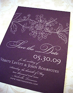
This ensemble began with a beautiful Save the Date card printed on aubergine paper with silver ink. The vintage floral print design and
combination of traditional scripts and contemporary block lettering set the tone for a elegant garden wedding.

Design by CJ Dickson for Williamson County Weddings & Events
Next up is the invitation. This classic ecru card was black ink was perfectly understated. The contemporary type setting and custom designed monogram brought a level of formality and tradition to the wedding that makes quite an impression.

Design by CJ Dickson for Williamson County Weddings & Events
Programs for the ceremony are often a last minute scramble but not for Verity and John. We took the formality of the invitation (as well as the beautiful monogram) and used a similar ecru card with black but softened the look with a
lavender satin ribbon. In the context of the garden ceremony, the added color was just enough to complete the look.
 Design by CJ Dickson for Williamson County Weddings & Events
Even the best laid plans can have a curve ball thrown in at the last minute. When plans change, I suggest letting your guest know about it in style! When circumstances led to a time change for the ceremony, we created this beautiful postcard for Verity & John's guests and mailed it out approximately one month before the wedding. Again, keeping with the classic ecru paper and black ink, we added another vintage floral design that fit perfectly with style of the wedding.

Design by CJ Dickson for Williamson County Weddings & Events
If I had my way, I would create a menu card for every event. It is just such a perfect way to finish a place setting and also let your guests know what they are being served. Notice for Verity and John, we used the same aubergine paper and silver ink as we did on the Save the Dates, but a different vintage
inspired design. Again, everything coordinates, but also stands alone. Considering context is very important. How and where your printed pieces will be used is an important consideration.

Verity, John and CJ at the end of a beautiful wedding day.
I hope article gives you some insight into creating a beautiful paper ensemble for your own wedding. Don't feel like everything has to be "matchy matchy." Just stick to the same color palette you are using for the entire event design and don't be afraid to try something a little bit different on each piece. Just consider the context in which each piece is being used when making your color selections and always remember - have fun! --CJ


